Sometimes it’s nice when a product launch falls when I’m on the road. I qualify that statement because, well, it’s one more thing to shoehorn into an invariably overloaded work trip. But there are some products that are just better tested on the road: laptops, earbuds, travel chargers and the occasional operating system.
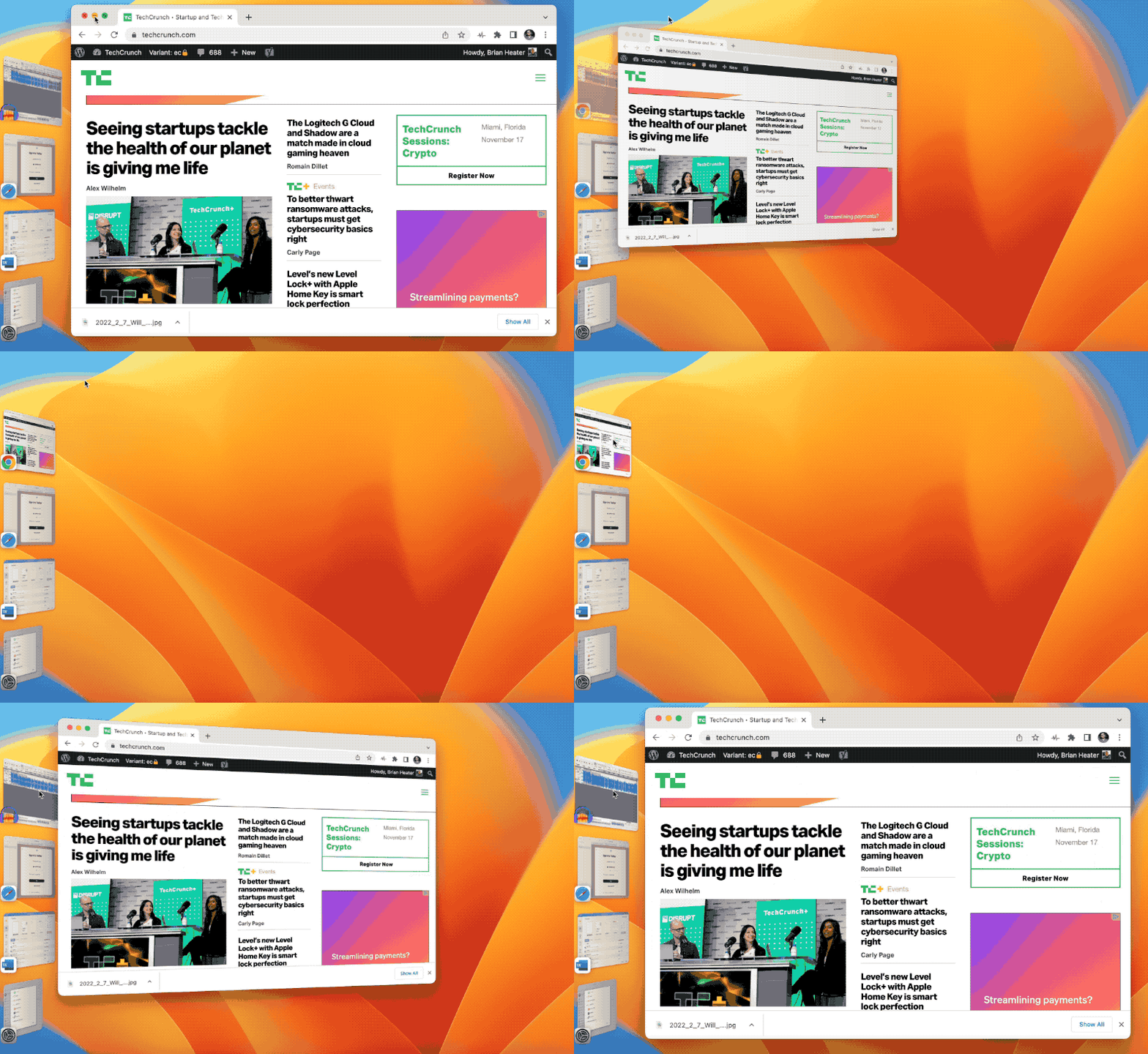
I’ve been running a beta of macOS 13 Ventura on my desktop since it was introduced back at WWDC over the summer. As ever, such things are not for the faint of heart. As I’ve noted before, I’ve really come to appreciate Stage Manager on the big screen. My adoption ratio for new macOS workflow features isn’t great — I usually use a majority of them for the duration of the review period and then immediately forget they exist.
Stage Manager has been through the ringer on the iPadOS side — and rightfully so. The beta implementations left a lot to be desired, contributing to the company’s decision to forgo iPadOS 16, in favor of skipping to 16.1 around a month or so later. I won’t say Stage Manager was perfect from the get-go on the desktop (what beta software really is?), but I enabled it on day one and have rarely found myself shutting it off, ever since.

Image Credits: Brian Heater
When enabled, the feature keeps all windows open concurrently on the desktop. The primary window occupies the majority of the space, and the others are minimized on the side of the screen. It’s a bit like a toolbar composed of open apps. Tapping any of these will swap them into the main staging area. You can also pull out a few and create a stack that will then be minimized and expanded together.
An underrated piece in all of this is the fact that all of the clutter on the desktop goes away when the feature is enabled. If you maximize the window, meanwhile, the sidebar will get out of the way. The feature still has some quirks I’d suggest Apple update. Unzipping a window, for instance, drops the Finder window you’er using back into the side bar. Pulling individual windows out of a stack can also be a bit annoying. Overall, however, you can make a strong case for Stage Manager as the best Mac productivity update in years. Happy to say here that I’ve been using it on the desktop and notebook alike.
Continuity Camera was greeted with mixed reception when it was introduced at this year’s WWDC. The critique is fair in the sense that it feels like putting a Band-Aid on a bigger issue, addressing the symptoms, rather than the root cause. The broader issue is that Apple has been neglecting laptop webcams for years. It’s an issue that was brought into sharp relief during the pandemic, for obvious reasons, and Apple has, more recently, been making the effort to improve video capture, through a combination of tweaks to the ISP and improved hardware.

Image Credits: Brian Heater
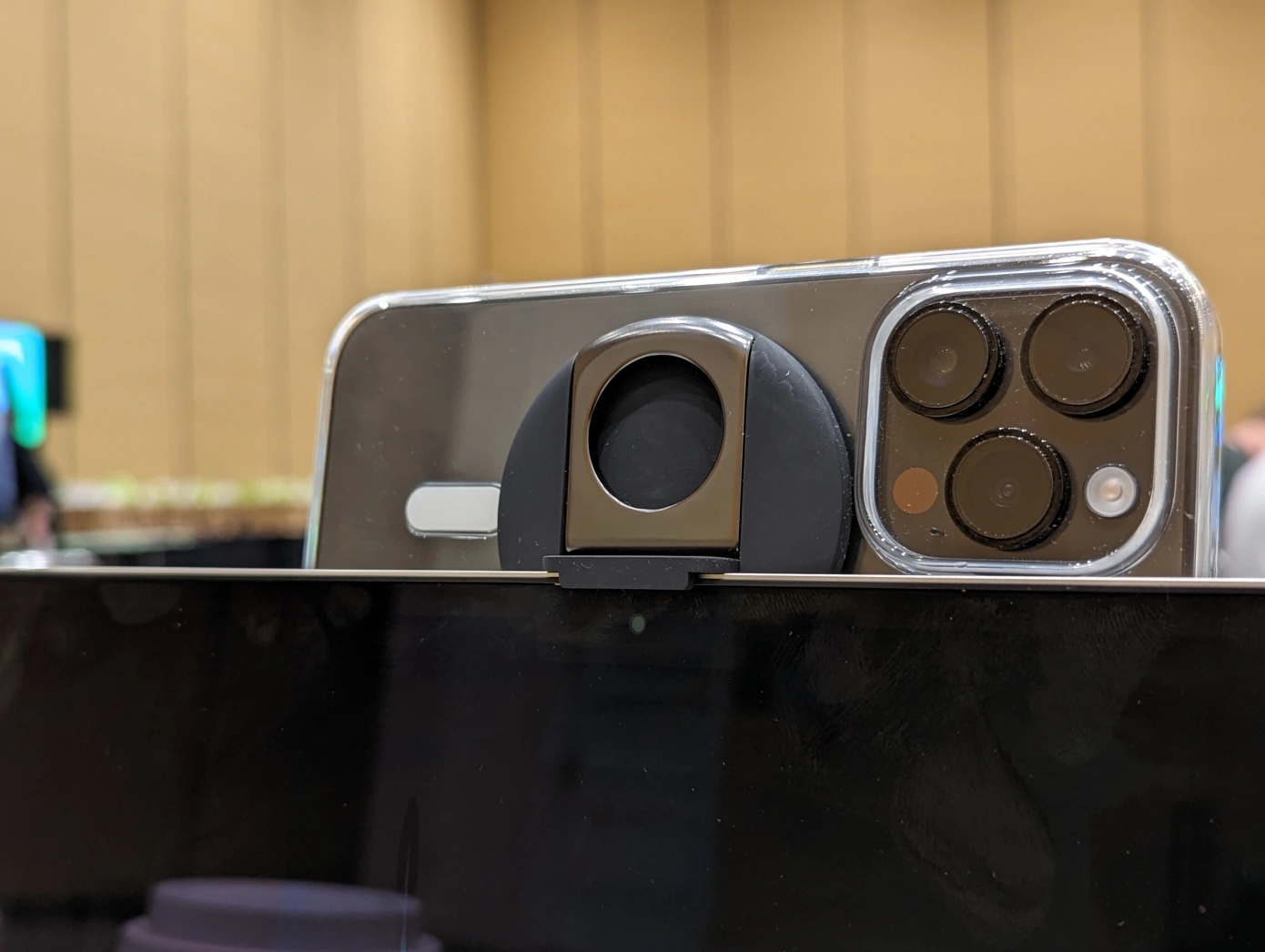
Continuity Camera was developed as a way of addressing the bigger issue with existing hardware. Instead of being forced to buy an external webcam or new Mac, it offers a way to leverage the iPhone as a kind of makeshift webcam. And let’s be real, the iPhone’s video capture is lightyears ahead of even the most recent Macs. Setup is simple, as long as the Mac and iPhone are running the same Apple account. Using a accessory like the one recently released by Belkin, you can mount it to the top of the laptop or desktop, right above the built-in webcam. The rear-facing cameras will do the webcam’s work. As far as solutions go, this isn’t among Apple’s most elegant, and as I noted in my Belkin write-up, the iPhone 14 Pro is too heavy for the Air’s lid to support at anything but a 90-degree angle. But the solution absolutely works in a pinch. I plan to keep the Belkin attachment in my cable bag, going forward.
Those are the two headline features in my estimation. Though, as ever, these sorts of releases are pretty major feature dumps, with updates across the board. Spotlight gets a lot of love, this time out. It’s one of those features you likely don’t think much about. I tend to limit my desktop searches to local files, and for everything else, I use Google.
Apple’s pushing to make the desktop version of Spotlight the kind of one-stop shop it has become on the iPhone. That certainly makes sense on a mobile device, but in the end, I’m not sure how much more convenient the macOS version is versus firing up a browser and searching Google. This time out, the feature offers a more streamlined design, along with searches within Photos, Messages and Notes — those, at least, are (hopefully) not things you’ll find in a browser-based search.
The list also includes entertainment searches for things like music and films. However, I’d say the handiest addition here are “quick actions,” which offer shortcuts for things like creating alarms and Shazaming music. That should save you a bit of precious time.
Safari tends to get a lot of love in these big system updates, and that certainly follows for Ventura. This is another place where I have to be upfront about not being a daily user. I’m just too wedded to Chrome as a browser and cloud-based account syncing service. The biggest news here is Shared Tab Groups, which lets you, well, share groups of tabs. Effectively, you make a group on a specific theme and can share them through a variety of methods, including Messages and Mail.
There’s a nice security overhaul on board, as well, with the addition of end-to-end encrypted sign in through Passkeys. Think of what Google offers with Password Manager. The company has also expanded the feature to extend to non-Apple devices.

Image Credits: Brian Heater
There are some truly welcome additions to Messages this time out. Now you can unsend a recent message or edit it. With the latter, the message will open as a dialogue box you can type directly into. Be forewarned, however, the app keeps a paper trail, courtesy of user feedback. Once edited, the message carries an “Edited” tag. Clicking into that will surface the edit history.
SharePlay is now available in Messages, so users can watch movies or listen to music together. Additional collaboration tools bring the ability to share notes, reminders and more through the app. The Photos app gets a bunch of new sharing options, as well, including a collaboration tool that lets you add a group of up to five people.
System Settings get a new — more iOS-like — design. The redesign certainly streamlines the process. There’s minimal learning curve if you’ve spent any time on an iPhone. The closing of the gap between macOS and iOS continues, unabated.
Last big thing worth noting on here is Freeform. Apple’s attempt to crack the frustrating world of virtual whiteboards has still not launched. The company continues to promise an arrival later this year. More on that closer to launch.
Meantime, Ventura is available now as a free download for Macs produced in 2017 and later.
A closer look at macOS Ventura by Brian Heater originally published on TechCrunch
from TechCrunch https://ift.tt/uqh2ZFC
via Tech Geeky Hub


No comments:
Post a Comment