The GameStop debacle has been hailed by many as a first of its kind form of digital activism, with the ‘crowd’ coming together to stick it to Wall Street, and specifically hedge funds that are in the business of short selling.
However, what if you’re a startup or scale-up caught in the middle of such an unprecedented and unstoppable set of events, requiring you to make rapid business and product decisions almost seemingly on the fly. Especially if there is significant reputational damage at stake when things don’t go to plan.
That’s exactly the position that trading platform Robinhood found itself in last week. Despite promising to make finance accessible for all, the company temporarily limited trading on GameStop, AMC, and other memestocks, leaving users upset that the fintech darling wasn’t living up to its name. The specific reasons may have been short-term and technical, but the choice was viewed with suspicion by much of Robinhood’s users, not least because Robinhood has a large hedge fund as a customer. This saw the Robinhood app receive hundreds of thousands of 1-star ratings on the app stores, which Apple and Google helped remove.
But what role did UX play in all of this and how could better UX choices have mitigated the Robinhood backlash? That’s the question we asked together with Built for Mars founder and UX expert Peter Ramsey, who tracked Robinhood’s product changes throughout the GameStop crisis.
If you want more UX content, Peter and Steve write a regular UX column over at Extra Crunch, so do also check out other recent UX teardowns:
- Hulu UX teardown: 5 user experience fails and how to fix them
- Disney+ UX teardown: Wins, fails and fixes
- Coinbase UX teardown: 5 fails and how to fix them
- (How to fix) 5 common UX mistakes in online banking
Specifically, we highlight 5 UX fails and suggest ways to fix them. As you’ll see, the fast moving events meant it was a continuously moving target and would have been very challenging for any product team. With that said, there are many learnings that can be applied to other existing digital products or ones you are currently building, regardless of whether or not you’re hit by the next GameStop-styled crisis.
Removing Gamestop from search results
Robinhood wanted to stop people buying GME shares, so they just removed Gamestop from the search results.
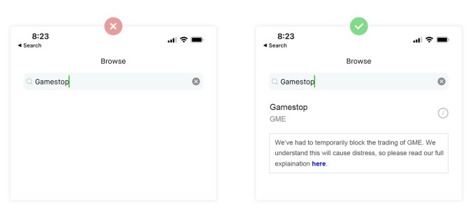
Image Credits: Built For Mars
The fail: Robinhood didn’t want people to find the page to purchase Gamestop shares, so they just removed Gamestop from the search results.
The fix: Robinhood absolutely should have left Gamestop in the search results. By removing it entirely the company did three things: created ambiguity, provided no explanation, and looked suspicious.
The rule: Great UX is about being definitive and clear, and the absence of information is the opposite of this.
Blocking people from buying Gamestop shares
People could still get on to the GME stock page, so Robinhood simply disabled the buy button and showed this generic message:
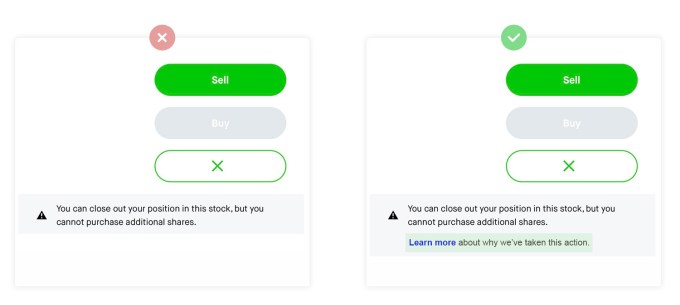
Image Credits: Built For Mars
The fail: Robinhood stopped people buying shares—essentially closing the free market—and disabled the buy button with a generic message.
The fix: This is an unprecedented move from a brokerage, and most Robinhood users will never have considered this to be a possibility. They should have included a link to more information about why they had to take this decision. In this instance, with insufficient info, users flocked to Twitter but found no explanation on the Robinhood Twitter account either.
The rule: When delivering bad news which will directly affect customers, you need to have spent the time to properly explain why this has happened, how it affects them, and what happens next.
Fractional shares are unavailable
Robinhood is known for fractional shares, but it temporarily blocked people buying fractional shares of Gamestop. This was after Robinhood re-allowed people to buy shares, but with limits:
No fractional shares
Limited number of shares
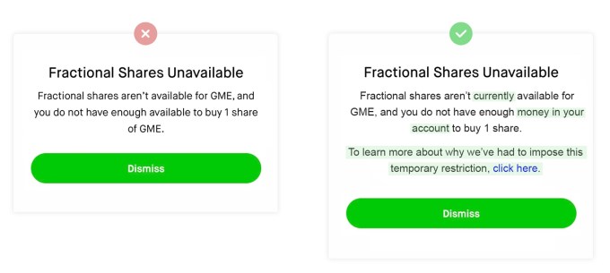
Image Credits: Built For Mars
The fail: When people tried to buy fractional shares, they would put in their order, and see this error message. It explains what you can’t do, but doesn’t provide any context as to why.
The fix: Simple: add context explaining why they’ve had to make this decision. The company removed one of the key USPs of Robinhood, and it didn’t even mention if it’s temporary.
The rule: You shouldn’t just add an explanation in one place and expect all your users to see it. You should proactively place links to your detailed response in all of the places and features that are affected by your restrictions.
Creating sell orders on your behalf
People were claiming on Twitter that Robinhood were automatically creating sell orders, and not allowing people to cancel them. (As it turns out, the T&Cs state that Robinhood has the legal right to do this.)
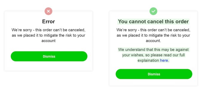
Image Credits: Built For Mars
The fail: If this is true, it means that Robinhood was taking drastic action to mitigate their liquidity issues. This action directly affects the finances of their users, and still, there’s no explanation why.
The fix: Whilst good UX can’t make this okay, a decent explanation in context of why they’re having to do this at least provides a good rationale. Also, it’s not an ‘error’, so labelling it an error feels disingenuous.
The rule: Stopping your user from doing an action is one thing, but taking control and doing something that may be against their will is another. This should only be done with sufficient context, explanation and empathy.
Failing to get statements
People wanted to leave Robinhood, and were claiming that other brokerages needed a ‘statement of portfolio’ to initiate a switch.
Twitter blew up as the ‘download statement’ function was broken for people all weekend. We never saw Robinhood address it, and naturally people assumed it was a dirty tactic to keep customers from leaving.
The fail: When trying to download a statement users saw this error message. This didn’t just happen once, but users were claiming that it was broken and they were unable to download their statements.
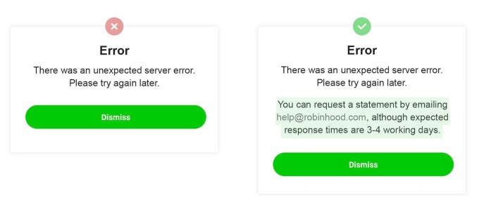
Image Credits: Built For Mars
The fix: Unlike the other examples, this doesn’t require more context, but does need an alternative method of reaching the same result. Some features are vital and urgent, some aren’t.
The rule: Some actions are important enough that it’s not good enough to just fail. In these instances, you need to provide an alternative way to reach the same goal.
from TechCrunch https://ift.tt/2MlC6kE
via Tech Geeky Hub


No comments:
Post a Comment